-
Case study
Esther Schipper
Artlogic Website Design Studio -
-

-
Working with Esther Schipper to create a new, visually impactful, yet story-driven site was both creatively challenging and exhilarating.
"[A website] is a valuable tool to inform artists, curators, and collectors about the breadth of our activities and to highlight new projects."
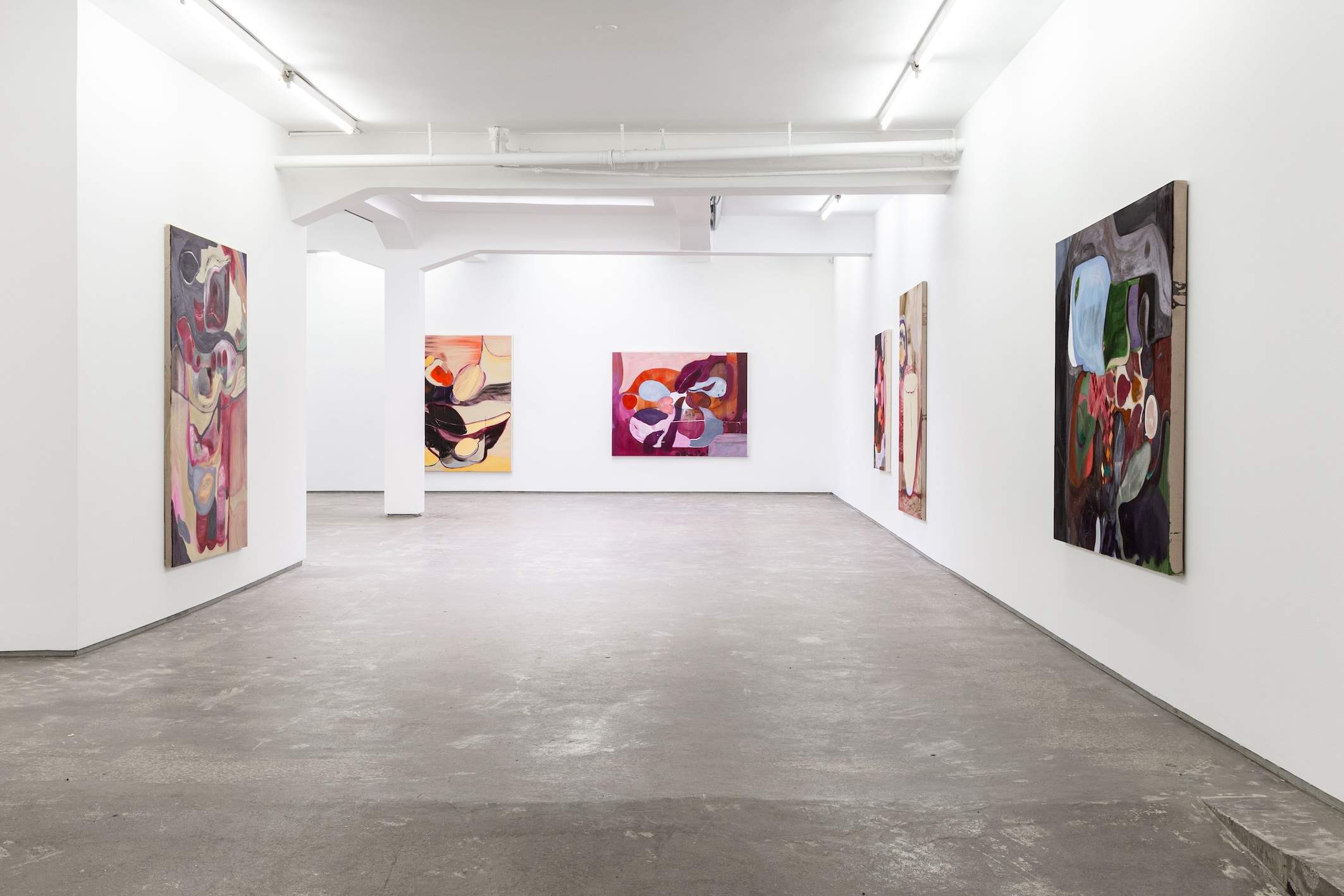
Pushing beyond exhibitions to include lectures, talks, performances, and musical events, Esther Schipper's mission is to exist as more than a gallery – to be a site of creative exploration. A legacy that the gallery’s new website set out to champion. Now, artworks sit at the website's focal point to shine a light on the gallery's multidisciplinary offering.
"We were looking to make the user experience more dynamic and provide a more curated selection of content which would also be communicated in its visual presentation."
-
-
"The old website had technical constraints for presenting the variety of projects that the gallery and gallery’s artists were undertaking."
Specialising in contemporary art, Esther Schipper has locations in Berlin, Paris and Seoul. The gallery has been in operation since 1989, and represents international artists across several generations working in all media.
Presenting groundbreaking exhibitions, Esther Schipper provides a platform for artists to present projects that mark novel territories, initiate important conceptual departures, and bring forth new bodies of works.
“The online presence of the gallery and the needs of our audience changed during the last few years." Needless to say, Esther Schipper’s impressive spectrum of talent and global reach required a website that can emulate its contemporary attitudes, further cementing its worldwide reputation, whilst paying a subtle nod to its art-world heritage.
-

To create a dynamic User Experience (UX), artwork pages feature a scroll-to-see function, giving a cleaner and more immediate interface for the user to engage with.
Other notable UX features include the homepage serving as a current 'hub' of the gallery's goings on. It’s constantly refreshed with current, exciting content by Esther Schipper giving any visitor a strong reason to return.
"Design elements are crucial to relay our exhibitions in the website’s online format."
Using a predominantly black and white palette, the site’s select colourful elements are encapsulated in vibrant featured artworks set against a white background that immediately catch the eye.
Meanwhile, Esther Schipper’s unique cursive logo, created by the gallery artist Liam Gillcik, sits in sharp juxtaposition with the site’s contemporary minimalism to elegantly unite the classical and contemporary arms of the art world in an almost romantic pairing of history and modernity."The team at Artlogic were super helpful and guided us through the process."
Artlogic's design studio used subtlety and ingenuity to follow a minimalist style guide, whilst still allowing Esther Schipper's content to really sing. The utilitarian, function before form approach posed a design challenge: transforming a content-heavy site into something elegant and design driven. There was nowhere to hide, and the design has to work really hard to convey a content-rich site in an elegant, user friendly way
To overcome this challenge, small design and UX features add touches of character and flourishes. For example, on the featured artists page, each artist is represented by a profile picture that places the artist front and centre. You can then hover over each face to reveal a shot of their artwork. By bringing the face of the artist to the forefront, Esther Schipper's site is humanised.


