Published June 9th, 2020
You’ll be forgiven if you can’t remember a time when you hadn’t heard the words ‘Online Viewing Room’. They have become the most talked-about online solution in the art world right now. However, even with all this hype and attention, it can be hard to get a clear understanding of how they differ from an online exhibition and what you need to do to make it a success.
What is an Online Viewing Room?
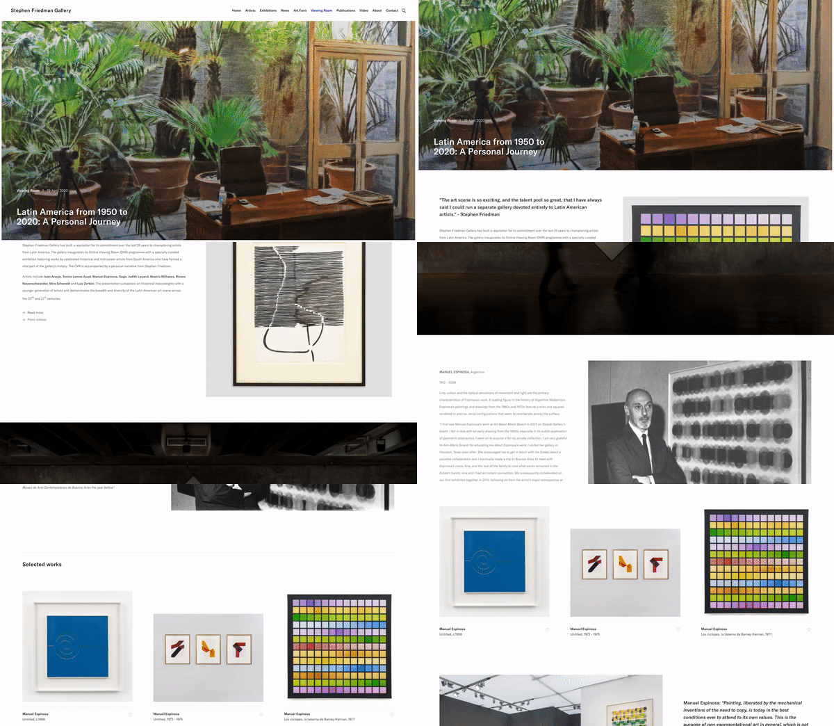
Simply put, an Online Viewing Room is a highly curated online presentation of artworks. Like an exhibition, they mostly have a start and end date - but after that there are no rules. Exhibition web pages normally follow a standard format. Online Viewing Rooms are usually more creative. They weave together videos, audio, quotes and background information, coupled with beautiful page animations and transitions, to produce an immersive visual experience. Often using different creative styles and specially commissioned content they engage and delight their visitors encouraging them to reach for that ‘Enquire’ button (‘Inquire’ for our US friends).
The more someone knows about an artwork, the more likely they are to buy.
Viewing rooms can take people behind the scenes, tell compelling stories and allow them to become more familiar with the artist, their intentions and the context of the work. We’ve seen clients double or even triple their online sales enquiries when using Online Viewing Rooms. The reason behind this is relatively simple; that the more connected someone feels to the artwork and the more confident and knowledgeable they are, the more likely they are to purchase.

Stephen Friedman Gallery Online Viewing Room
“We have seen a substantial increase in visitors on our site and newsletter subscribers directly linked to interest in our Viewing Rooms. It should also be mentioned that our sales enquiries come to us in so many different ways from the web that the Viewing Rooms add to and enhance communication and sales.”
Julia Séguier | Head of Research and Editorial Content | Esther Schipper
5 ways to get the most out of your Online Viewing Room.
Since the power of Online Viewing Rooms is in their ability to surprise and flexibility of content, there isn’t a one-size-fits-all solution but here are 5 of our top tips to get the most out of your viewing room.
-
Data capture tools
-
Time-limits & VIP access
-
Price transparency
-
Provide a sense of scale
-
Thoughtful presentation
Data Capture
Perhaps not the sexiest of features to start with but it is one of the most crucial. A data capture form means that visitors need to provide their contact information, usually their first name, last name and email address, in return for access. Your first thought might be that this would put some people off, but, in our experience, the outcome is positive for both the visitor and the gallery. It allows galleries to build lifelong relationships with people who may have never thought about signing up to your mailing list or enquiring about an artwork. The visitor gets to stay updated about relevant exhibitions and artworks and has access to high-quality online content without payment or subscription. If the experience is rich and enjoyable, your visitors will tend to feel it was a fair trade. Using data capture is your choice and an easy setting to turn off and on.
See our help notes on setting up your data capture forms

Time-limits & VIP Access
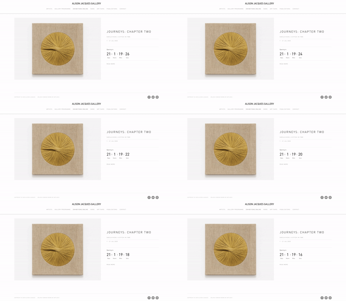
As with a physical exhibition or live event, making something time-limited helps generate a buzz and a sense of occasion. We recommend sending marketing announcements in advance of an Online Viewing Room opening and use the countdown timer on your viewing room webpage to indicate when it will be opening. You may also want to consider using private Online Viewing Room links in advance of a public opening to offer your VIP collectors early access. Even with online-only events, your most valued clients will still want, and appreciate, a certain level of exclusivity.
See our help notes on VIP Access
Close deals with fewer requests for discounts.
Price transparency
Displaying prices online for higher valued art is a relatively new phenomenon. Based on our clients' experience, there are two main reasons why price transparency seems to be a good idea. Firstly, it generates more legitimate, less speculative, enquiries. It is true that if collectors know the price, they may not contact you if the artwork is beyond their budget, leading to fewer enquiries. However, the enquiries you do receive will be more legitimate sales leads.
Secondly, we have received feedback from clients that price transparency has meant fewer requests for discounts. When you are upfront about pricing, collectors don't know who else is viewing the artwork online at the same time, so trying to negotiate on the price risks them losing out on the work altogether.
See our help notes on online stores
Providing a sense of real-world scale
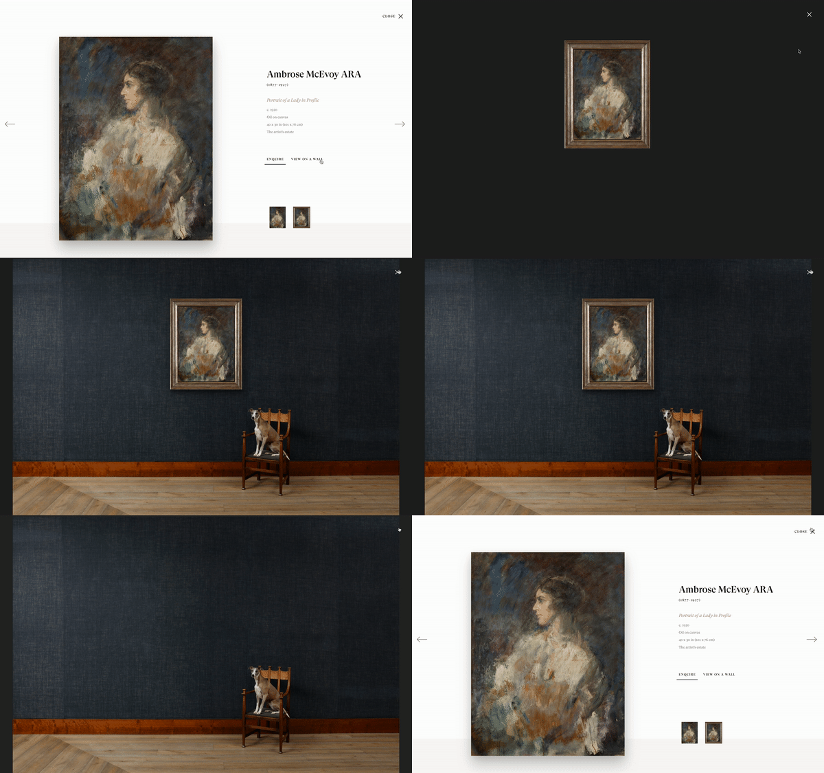
We’ve all looked at artworks online and had to reach for the tape measure or glanced at our wall, wondering whether or not it would fit in our homes. If someone can’t visualise how big something is, or what it is like to stand in front of it, they are less likely to proceed to purchase. To avoid this happening, you can use tools such as our ‘View on a Wall’. Using the dimensions of the artwork, it cleverly positions it into a digital environment with an object next to it, either an item of furniture or a person, to provide context and scale.
This example on Philip Mould’s website is, without doubt, our favourite ‘View on a Wall’ to date. That is partly because we love dogs, it is true. But it is also a shrewd move because it is surprising, it is original and it conveys something of the personality of the gallery. I hear you asking “What should I do with sculptures or 3D works?” - our advice would be to take a real photograph of the sculpture next to an object for scale and put this on the artwork’s page as an additional detail image. Here is a good example on Stephen Friedman’s website.
Pawfectly to scale
See our help notes on using View on a Wall
Thoughtful presentation
In 1996 Bill Gates famously wrote that “content is king” but what he didn’t say was… "know when to stop!". One work beautifully presented might excite more interest and curiosity than thousands of words and a page of thumbnails. As humans, we tend to engage far more with great storytelling. You have an opportunity to talk directly to a worldwide audience of collectors, maybe from a device in the palm of their hand. Use it to offer insights that nobody else could about the creation of the work or the life of an artist. Your knowledge, passion and authority will create an engaging narrative.
In an art fair, the colour of the walls, the layout of the booth, the floor, the lighting are all considered. You may not hang all the work you bring to make sure that when you enter the booth, you are focused on one object first. Just like an art fair, we encourage you to consider the layout, format and other content of each viewing room to reflect the subject matter and to keep your viewing rooms feeling new, exciting.
See our overview help note on viewing rooms.
Is there a magic formula to creating a great Online Viewing Room?
The short answer is 'no'....sorry. For online viewing rooms, much like a physical exhibition, the elements that will elevate it from good to magnificent can be largely intangible. But try and identify what resonates with you (or not) in the digital world. Recognise what will connect with your own clientele. Implementing the practical tips we have outlined above with some good ideas and careful content-planning, will certainly set you off on the right path.
Our advice is to get creative, think outside of the box and push the boundaries of what an Online Viewing Room can be. There are no set rules!
Find out more about Online Viewing Rooms here


