1. Think mobile
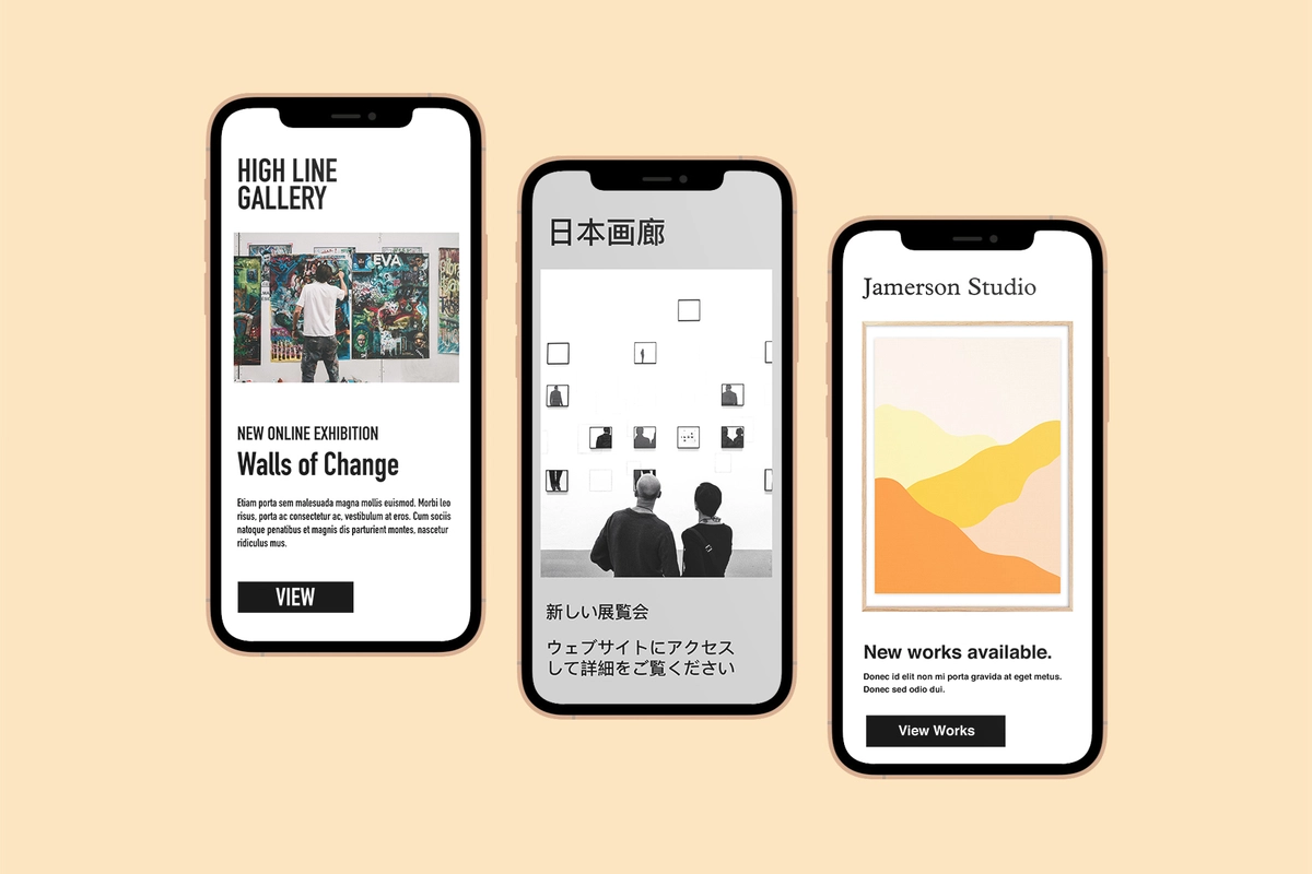
46% of people opt to read their emails on their phone (Hubspot). Read that again, so you remember it, as that is half of your mailing list. We often forget when composing on a laptop or desktop how the email might look and feel on mobile. What might seem like a few short paragraphs and images on a desktop can quickly turn into a lengthy read on a mobile. Luckily we have a clever tool called 'Preview' in the email composition screen in the database. It shows you how your email will display on a desktop and mobile. When using 'Preview', take the opportunity to edit copy, check text sizes and images to strike the right balance between desktop and mobile. Don't miss out on the opportunity to engage with half of your audience!
2. Gallery recognition is key
In our daily lives, we are bombarded with hundreds of messages and emails. From viewing room openings to newsletters from places you can't ever remember signin up to, it can be a lot. Making sure the person reading it knows it is you when they open the email is essential. Never assume that because they have opened your email, they have fully understood who the sender is. Lead with your branding to increase brand awareness. Displaying your logo and colours in the header of your email is an effective way to start your newsletter. Doing this will help you to build brand awareness and trust with your collectors over time. Sounds like a no brainer but you would be surprised how many mailings still don't feature a gallery name or logo at the top.
3. Consider the structure
Structuring your newsletters is key to increasing click-throughs and mitigating unsubscribes. Your collectors will appreciate being able to quickly see what your email is about and which parts relate to their interests. Here is a way to visualise why the structure of your emails is important. Imagine if you wanted to enter a shop and it has 8 different doors with 8 different signs for different departments. You would likely feel overwhelmed with choice, get bored of trying the pick the right one and abandon the whole situation. The same goes for email. Point your readers in the right direction using a clear button or CTA (call-to-action) for example 'Visit online exhibition' then let them explore the rest of your website from there. Try only having 1 or 2 CTAs per email and make the buttons stand out (a hyperlink in a paragraph just won't cut it these days!).
4. Avoid clutter
Sometimes adding more can seem like a good idea and throwing the kitchen sink at it might feel like you are increasing your sales opportunities. When composing a mailing try to find time to reflect and take a step back to see what is working and what is not. Always remember the golden rule of a mailing; to inform and generate click-throughs. Use this as your guiding principle, and if something looks like clutter, it probably is, so remove it.
Here are some ways to keep the visual clutter to a minimum:
- Use a maximum of two fonts in one email and always use the same font in every mailing
- Avoid bolding every third word and having lots of different text sizes
- Only ever use one or two GIFs per email, any more and it will be a distraction
- Avoid colour clashes and keep colours to a minimum. We've all been sent that email with white text on a turquoise background - not so easy to read
- Use borders and large buttons sparingly
Try to put yourself on the receiving end and think what would keep your attention and what would distract you.
5. Be consistent
We all have our favourite newsletters and emails from galleries and brands that we look forward to receiving. Now, I would urge you to go and look at all of them and see if you can find a common thread...
...it is consistency.
We are creatures of habit. We like to know what we are getting into when we engage with brands. Find a design format that works for your gallery or studio and stick with it. Always change anything that isn't working but remember that consistency over time builds a relationship with your collectors. It doesn't just apply to the design. It also applies to how you approach the tone of the copy, subject headings and even the time of day you send it out—having a cheeky tone one week and then being overly formal the next will be confusing.
Here's an example: if you send your mailings at noon on a Monday for four weeks, chances are people will come to expect it to arrive in their inbox at noon on the fifth week. Suddenly changing this and sending it 9 pm will likely lead to lower open rate, fewer click-throughs and some missed sales opportunities.
Building good open rates and click-through stats takes time. It's all about building trust and meeting expectations. These tips should help you get there more quickly.
Bonus tip! Use tracking links
Be smart with your links and use URL tracking to see data in your Google Analytics. You can easily put in the email campaign name, mailing list name, button name etc, and all this data will appear in your analytics so you can see how it impacts your site performance. Build tracking links here.
See our help note on Google Analytics and how it can help you